Create a simple theme switcher with custom preset colors
Some users prefer their themes light, some dark, this might differ depending on the room’s brightness or time of day. Why not enhance your app with a brand new theme switcher to meet their needs? Today, we’ll put together a simple component that will offer your users a way to select between dark and light mode, additionally we’ll provide a small range of color presets to choose from. Clone the blog repo or spin up a new Phoenix project with mix phx.new(just remember to change MyBlogWeb with the name of your app) and let’s dive right in.
This article explains how to implement a theme switcher.
Contents
- Adding custom colors
- Creating a header
- Assembling the theme switcher
- CSS media query script
- Client hook
- Visualization
Adding custom colors
The first step in our course of action, is to setup a collection of colors. Open up app.css in assets/css/ directory and create new selector :root. Here we’ll add a variable for height of our header, which we’ll be building in the upcoming section.
@import "tailwindcss/base";
@import "tailwindcss/components";
@import "tailwindcss/utilities";

/* This file is for your main application CSS */
:root {
  --headerH: 5rem;
}
The whole idea behind the preset switcher is based on html attributes. Since we can add any attribute we like, we’ll use javascript to modify them on the html element. When the user changes the color, css will apply adequate styles. We can easily achieve that by matching attribute selector e.g. :root[data-theme="name_of_our_preset"]. So, with this explained, let’t start creating our styles. I’ll do two colors in light and dark modes, but you can keep on racking them up as much as you like. We’ll prepare a base color, an accent, a background color, a second background color(for building headers, footers etc), text and alternate text colors. All of the variables will be in HSL format, notice that we are inputing only percentage values and remember to keep all the variable’s names the same in every preset.
@import "tailwindcss/base";
@import "tailwindcss/components";
@import "tailwindcss/utilities";

/* This file is for your main application CSS */
:root {
  --headerH: 5rem;
}
:root[data-theme="blue"] {
  --accent: 225 100% 60%;
  --bg: 0 0% 95%;
  --bgUi: 0 0% 0%;
  --text: 0 0% 5%;
  --textUi: 0 0% 95%;
}
:root[data-theme="blue-dark"] {
  --accent: 225 100% 60%;
  --bg: 0 0% 7.5%;
  --bgUi: 0 0% 0%;
  --text: 0 0% 95%;
  --textUi: 0 0% 95%;
}
:root[data-theme="green"] {
  --accent: 90 100% 30%;
  --bg: 0 0% 95%;
  --bgUi: 0 0% 0%;
  --text: 0 0% 5%;
  --textUi: 0 0% 95%;
}
:root[data-theme="green-dark"] {
  --accent: 90 100% 30%;
  --bg: 0 0% 7.5%;
  --bgUi: 0 0% 0%;
  --text: 0 0% 95%;
  --textUi: 0 0% 95%;
}
Now, open the tailwind.config.js file located in assets/ directory, you’ll see the theme property there. We’ll now add the variables to the configuration file, that we introduced in app.css. Add them in accordance to the code block provided below, in the theme.extend.height and theme.extend.colors properties of the module export:
theme: {
    extend: {
      height:{
        header: "var(--headerH)"
      },
      colors: {
        accent: "hsl(var(--accent) / <alpha-value>)",
        bg: "hsl(var(--bg) / <alpha-value>)",
        "bg-ui": "hsl(var(--bgUi) / <alpha-value>)",
        text: "hsl(var(--text) / <alpha-value>)",
        "text-ui": "hsl(var(--textUi) / <alpha-value>)",
        brand: "#FD4F00",
      }
    },
  },
Creating a header to hold the theme switcher
Nice, with variables set up, we can now begin to create a component that will hold our switcher. In web developement, it is a widely adopted practice to place it in the page’s header, so let’s do just that. In lib/my_app_web/components directory, create a new folder header, inside it, header.ex and theme_swither.ex files. Let’s begin our work on the header by defining the module and injecting the code of live component by typing use MyBlogWeb, :live_component. After this, we need to implement two live_component callbacks: update/2 - responsible for handling the component’s state and render/1 - this will render our html with the help of ~H sigil. We will also place here our ThemeSwitcher component, which we’ll build next.
defmodule MyBlogWeb.Header.Header do
  use MyBlogWeb, :live_component

  def update(assigns, socket) do
    {:ok, socket |> assign(assigns)}
  end

 def render(assigns) do
    ~H"""
   <header class="h-header relative">
      <div class="h-header fixed w-full bg-bg-ui/90 text-text-ui z-10 px-8 flex gap-2 items-center">
        <nav class="flex justify-start items-center w-full gap-2">
          <div>
            <.link navigate={"/"} class="px-6 rounded-sm py-2 hover:bg-accent text-2xl font-bold transition">My Blog</.link>
          </div>
          <div>
            <.link navigate={"/blog"} class="px-6 rounded-sm py-2 hover:bg-accent text-xl font-semibold transition">Blog</.link>
          </div>
        </nav>
        <.live_component module={MyBlogWeb.Header.ThemeSwitcher} id="theme_switcher" />
      </div>
    </header>
    """
  end
end
Assembling the theme switcher
We added our custom height and colors to text, background and hover transitions within the header, get ready to build the markup and logic for the switcher. Open theme_switcher.ex and repeat the steps from previous component, that is, define the module, inject the live component code, define update/2 and render/1 callbacks. In the mount/1, we’ll create options list containing names of our themes, return a standard liveview tuple with an :ok atom and pass couple of assigns to the socket. The first one will be component id, second will be our list of themes and last one will control whether the list is visible to the user or not.
defmodule MyBlogWeb.Header.ThemeSwitcher do
  use MyBlogWeb, :live_component

  def update(assigns, socket) do
    options = ["blue", "blue-dark", "green", "green-dark"]
    {:ok, socket |> assign(:id, assigns.id) |> assign(:options, options) |> assign(:show, false)}
  end
end
In the render/1, build a div that will encapsulate our theme switcher, along with a button, to show or hide it, depending on the state of show boolean. The phx-target={@myself} annotation specifies, that the event emited by the button will reach the component instead of an active liveview process(as per docs). We’ll also add a phoenix binding phx-click={if !@show, do: "open_theme"}, it will reside within the button and be responsible for showing the select element, Additionally, phx-click-away will be placed within the div containing the select tag, assigning false to show variable, whenever the user clicks somewhere beyond the div’s border. And finally, we’ll provide a phx-hook binding to the select element, this will run our logic that takes care of changing the html attributes.
def render(assigns) do
    ~H"""
      <div class={"flex items-center justify-end gap-2 rounded-lg #{if @show, do: "bg-accent w-60", else: "bg-bg w-0"} transition-all"}>
        <.button
          class={"order-2 group hover:ring-2 ring-accent #{if @show , do: "ring-2"} transition"}
          aria-label="toggles the theme selector"
          type="button"
          phx-target={@myself}
          phx-click={if !@show, do: "open_theme"}
        >
        🎨
        </.button>
        <%= if @show do %>
          <div
            class="order-1 top-12 right-0 p-1 rounded-md"
            phx-click-away="close_theme"
            phx-target={@myself}
          >
            <label class="invisible" for={"theme_switcher_select"} aria-label="theme selector label"></label>
            <select
              aria-label="theme selector"
              id={"theme_switcher_select"}
              class="group-hover:bg-accent text-text rounded-md text-sm p-1 w-[20ch] bg-bg transition"
              phx-hook="HandleTheme"
            >
              <%= for o <- @options do %>
                <option value={o}>
                  <%= o %>
                </option>
              <% end %>
            </select>
          </div>
        <% end %>
      </div>
    """
  end
So far so good. We placed some event emiters in the previous paragraph. Time to handle them in our component. We simply use handle_event/3, callback, pattern match incoming event to open_theme and call assign/3 passing in the socket, atom :show and true. We do the same for close_theme event and assign false to the socket in similar fashion.
  def handle_event("open_theme", _unsigned_params, socket) do
    {:noreply, socket |> assign(:show, true)}
  end

  def handle_event("close_theme",_params, socket) do
    {:noreply, socket |> assign(:show, false)}
  end
Our component is almost ready, we can now wire it up. Open app.html.heex in lib/my_app_web/components/layouts/, delete the <header> element and replace it with our live_component:
<.live_component module={MyBlogWeb.Header.Header} id="header" />
<main class="px-4 py-20 sm:px-6 lg:px-8">
  <div class="mx-auto max-w-2xl">
    <.flash_group flash={@flash} />
    {@inner_content}
  </div>
</main>
CSS media query script
Browsers have different ways of managing data, one of them is localStorage, it enables developers to keep data in a key-value pair format. We’ll use it to store user’s choosen theme, uihough it is not recommended to put there any important or critical information as it is easily accessible. Whenever a new user visits our site or they deleted the theme value manually, we have to detect which color scheme they favour and set a new theme accordingly. By using window.matchMedia javascript function and prefers-color-scheme CSS media query, we can easily achieve this. Let’s create a new file in priv/static/assets/, name it theme.js and use setAttribute to add a new attribute with a name of one of our presets as a value to the html element.
if(localStorage.theme){
     document.querySelector("html").setAttribute("data-theme", localStorage.theme)
} else {
    if(window.matchMedia("(prefers-color-scheme: dark)")){
         document.querySelector("html").setAttribute("data-theme", "blue-dark")
    } else {
         document.querySelector("html").setAttribute("data-theme", "blue")
    }
}
In order for the script to run we need to add it to the root.html.heex in lib/my_blog_web/components/layouts/ directory. Just place it at the end(but still within) of the head element.
 <script type="text/javascript" src={~p"/assets/theme.js"}>
    </script>
We also must add the script file to the .gitignore, as everything inside priv/static/assets/ directory is automatically excluded by git. Simply add a *(asterisk) sign at the end of /priv/static/assets/ entry and the following line bellow it(this is important!) in the .gitingore file:
/priv/static/assets/*
!/priv/static/assets/theme.js
Client hook
Great, with previous steps completed we may attach a new hook to the LiveSocket in assets/js/app.js. Open it and create the Hooks object, just below the imports at the top of the file. Now add a new hook called HandleTheme and place it within the mounted callback, it will run after the element it is attached to is added to the DOM, and after the liveview process that renders it has finished mounting. We are going to grab the select element we whiped up earlier and the theme value from localStorage, we’ll check whether the select element is rendered on the page, if it’s not, we’ll just stop there, if it is, we’ll continue. We’ll loop over options and check whether the theme value is contained there. When we get a match, we’ll call setAttribute with selected and true as arguments. Next we’ll add a new event listener to every option element and provide a callback, that will set the data-theme attribute on the html element with the value of an element that initiated the event. Lastly, the function will save the theme in localStorage.
let Hooks = {}
Hooks.HandleTheme = {
  mounted() {
    const select = document.getElementById("theme_switcher_select")
    const html = document.querySelector("html")
    let theme = localStorage.getItem("theme")

    if(select !== null) {
      Array.from(select.options).map(o => {
        if(o.value === theme){
          o.setAttribute("selected", true)
        }
      })

      select.addEventListener("input", (e) => {
        html.setAttribute("data-theme", e.target.value)
        localStorage.setItem("theme", e.target.value)
      })
    }
  }
}
Before we move further we have to pass our Hooks object to the liveSocket:
let liveSocket = new LiveSocket("/live", Socket, {
  hooks: Hooks,
  longPollFallbackMs: 2500,
  params: {_csrf_token: csrfToken}
})
Visualization
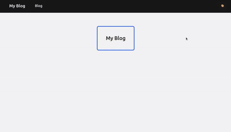
Time to use our header. Create live folder in lib/MyBlogWeb/, within, we’ll place a new liveview file home_live.ex and construct a simple markup returning <h1> tag.
defmodule MyBlogWeb.HomeLive do
  use MyBlogWeb, :live_view

  def mount(_params, _session, socket) do
    {:ok, socket}
  end

  def render(assigns) do
    ~H"""
    <div class="flex justify-center">
      <h1 class="text-xl font-semibold ring-2 ring-accent p-2 rounded-md">My Blog</h1>
    </div>
    """
  end
end
Let’s add it to the router.ex file, so our app knows what to render when we navigate to “/“ path. Replace the get with the live macro, providing a path “/“ and our HomeLive module in the default scope "/":
live "/", HomeLive
Head to root.html.heex layout in lib/my_blog_web/components/layouts/ and replace the classes on body element with bg-bg text-text, this will set the colors of text and background in our entire site.
If you’ve cloned the blog repo, you may go to other liveview files and the createAndAddCopyButton function in app.js to change the styles, so they’re incorporating the new system we just implemented.
Now you can entertain your users with a simple theme switcher that assigns color schemes depending on their preferences. Additionally, it keeps track of selected presets locally. 🎉